Abstract
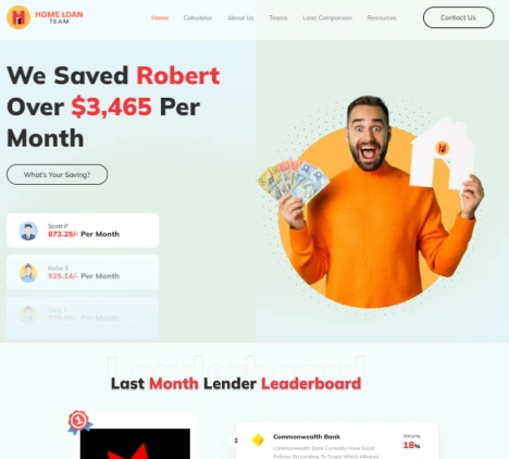
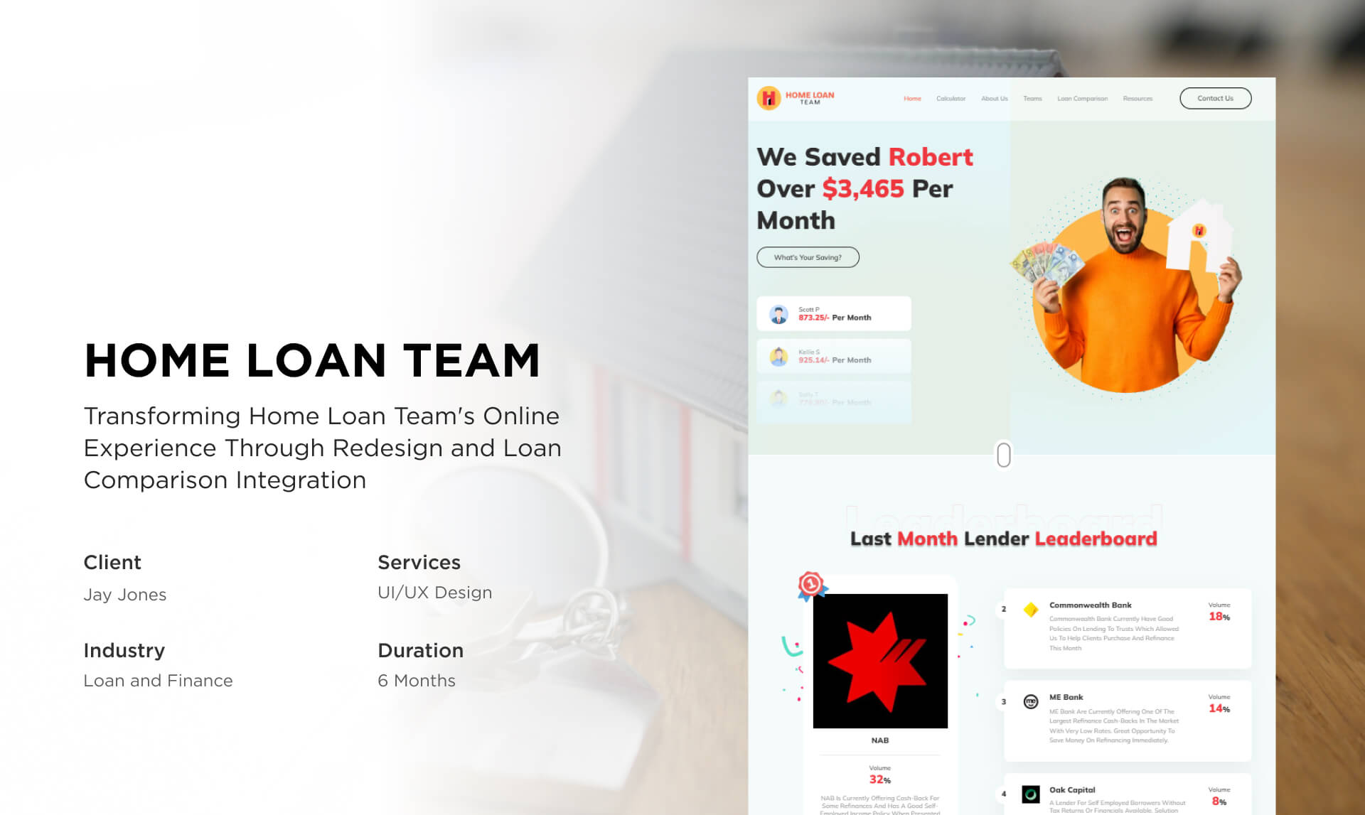
Home Loan Team, a prominent Mortgage Brokers group specializing in Home Finance, approached us with a pressing challenge – their existing website suffered from subpar UI/UX and lacked a robust loan comparison tool. Struggling to provide an optimal user experience and enable borrowers to make informed decisions, they sought our expertise.
Leveraging our technical acumen, we devised and executed a comprehensive solution that involved enhancing the website’s UI/UX and seamlessly integrating an advanced loan comparison tool.
Home Loan Team: An Introduction
Home Loan Team, is a dedicated group of Mortgage Brokers with expertise encompassing the entire spectrum of Home Finance. They excel in equity release, refinancing, and aiding clients with credit challenges. The team facilitates property acquisitions, from first homes to investments, and extends services through the Car Loan and Business Loan Teams.
While their online tools provide insights, clients are encouraged to research and review loan terms independently. You can trust the Home Loan Team to guide you toward the right loan lender.

Jay Jones
Founder
Major Obstacles We Overcame
Through a meticulous and comprehensive approach, we successfully redesigned their website and integrated a cutting-edge loan comparison tool, significantly elevating their digital engagement. See how we overcame these obstacles for our client:
Problem:
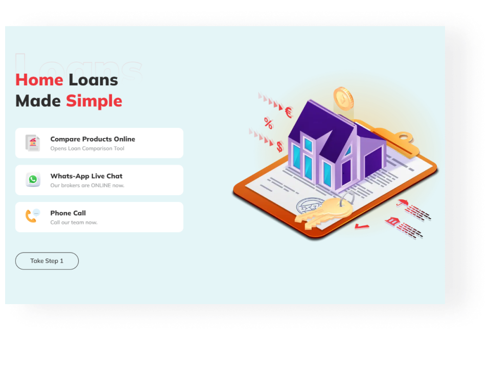
The client’s existing website lacked coherence and had a poor user experience.
Solution:
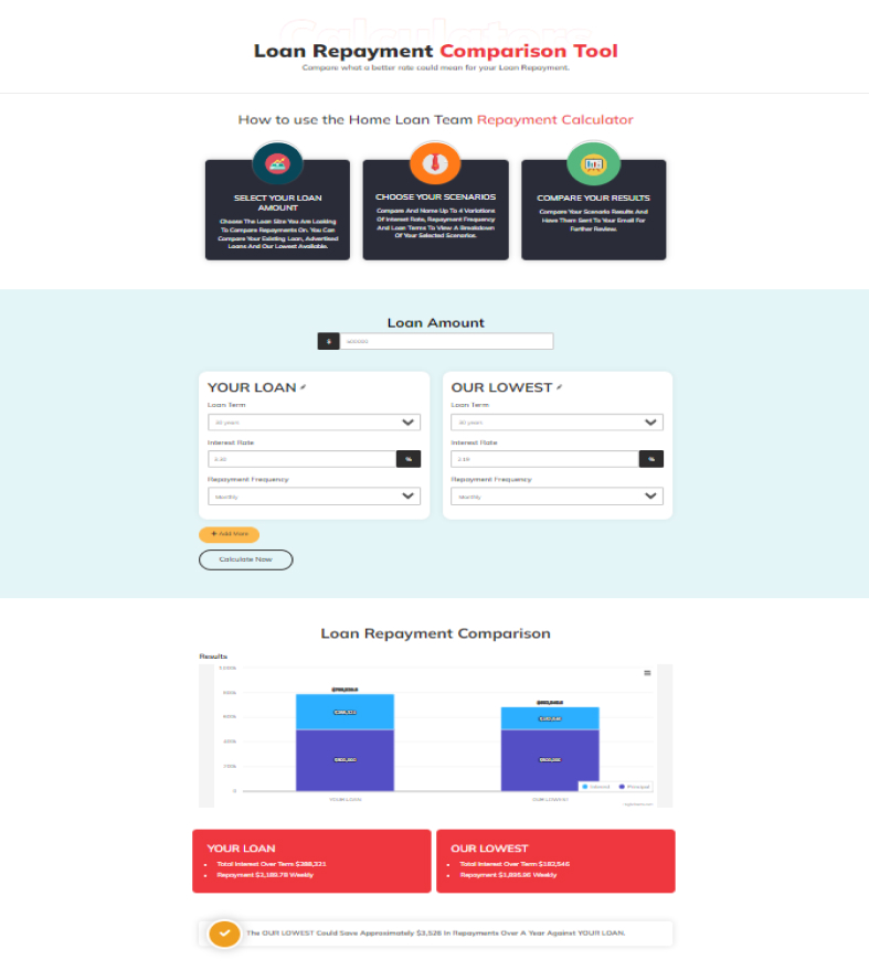
In response to this challenge, we undertook the task of redesigning an outdated and cumbersome website into a sophisticated loan comparison platform. Our objective was to empower borrowers to effortlessly compare loans from various lenders, all from the convenience of their own homes. By transforming the website into an intuitive interface, borrowers can now access a comprehensive overview of loan options, interest rates, fees, and other critical factors affecting loan costs. This innovative solution effectively eliminates the need for in-person visits to multiple banks or lenders, saving borrowers valuable time and effort.
Problem:
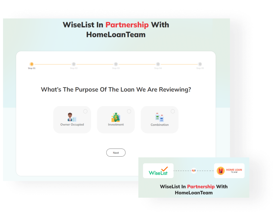
The client struggled in providing the most suitable loan vender options to the borrowers from a long list.
Solution:
Our solution addresses this challenge through a strategic collaboration with WiseList, a leading budgeting and savings app. We developed a Home Loan comparison tool that revolutionizes the way borrowers explore lending opportunities. By seamlessly integrating WiseList’s database, our platform fetches and presents lender data aligned with borrower preferences, expanding the spectrum of available loan options. This transformative tool empowers borrowers to receive a more optimal and personalized borrowing experience.
Problem:
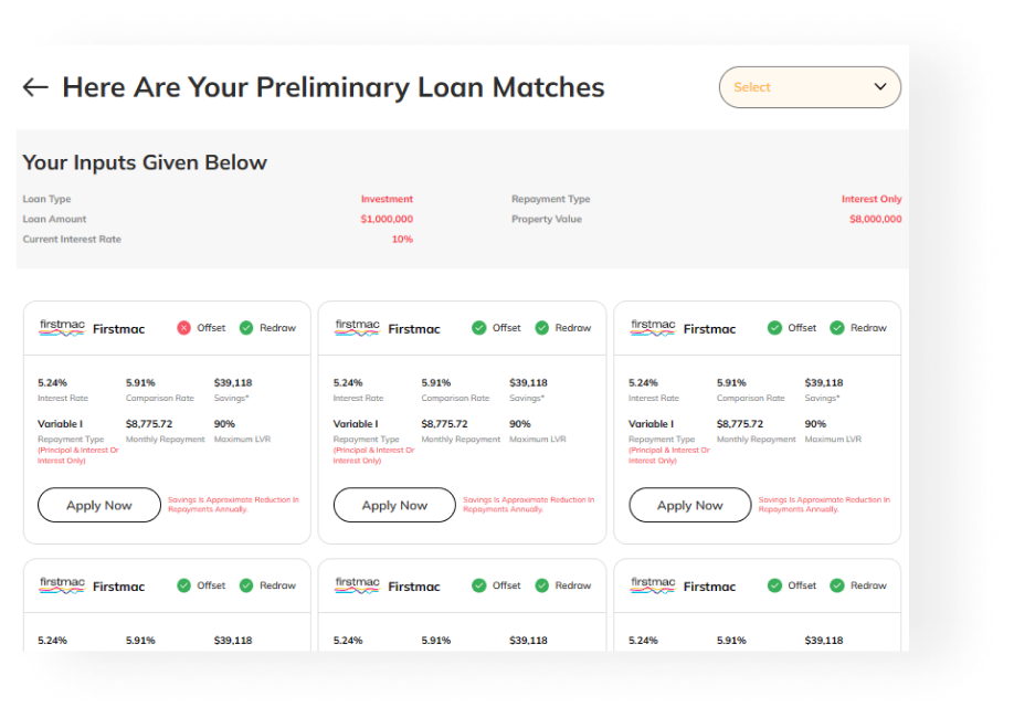
The website lacked transparency and clarity surrounding loan terms, interest rates, and associated fees resulting in potential financial setbacks for the borrowers.
Solution:
Our proactive response to this problem was to improve the website’s information structure. We equipped the website to offer borrowers clear and concise information about loan terms, interest rates, fees, and other crucial factors that significantly influence the total cost of a loan. By presenting this information in an easily understandable format, borrowers can now make well-informed decisions that align with their financial goals.
Problem:
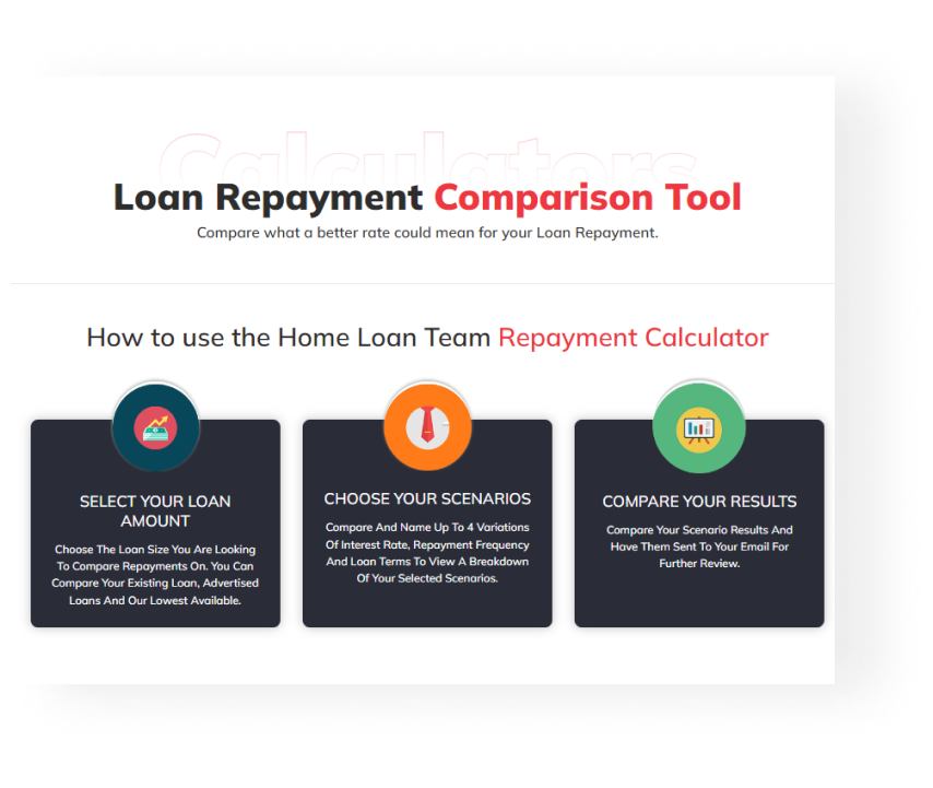
The initial website’s lackluster UI/UX design posed a significant barrier for borrowers, impeding their ability to seamlessly access critical loan information.
Solution:
To alleviate this concern, we made a comprehensive UI/UX refinement process. Our approach encompassed an extensive redesign of the website’s front-end and back-end components, with the primary aim of delivering an engaging, visually appealing, and user-friendly interface. By strategically aligning design elements and optimizing user pathways, we created an intuitive user experience that streamlines the journey from loan comparison to getting in touch with lenders.
Problem:
The website’s sluggish performance was hampering its overall performance.
Solution:
By delving into the intricacies of website architecture and performance optimization techniques, we successfully enhanced the platform’s speed and responsiveness. The optimized website now provides users with a swift and frictionless experience, ensuring that borrowers can efficiently navigate through loan comparison options, retrieve information, and complete the application process without unnecessary delays.

Our Approach (Process)
Our transformative process encompassed strategic stages from analysis to innovative redesign, rigorous testing, and performance optimization. Each phase was underpinned by our unwavering commitment to technical excellence.

01. Strategic Assessment

02. Design Blueprint

03. API Integration

04. UI Optimization

05. Performance Enhancement

06. Testing and Refinement
Want To Develop Your Own Solution?
We make full fledged customized strategies for the businesses planning to get started with the solutions and provide an excellent user experience to all your customers.
Outcomes We Delivered
Our years of experience in delivering standout UI/UX projects powered us to give an effortless and highly convenient feel to the client’s website. Have a look at the results we generated for our client:
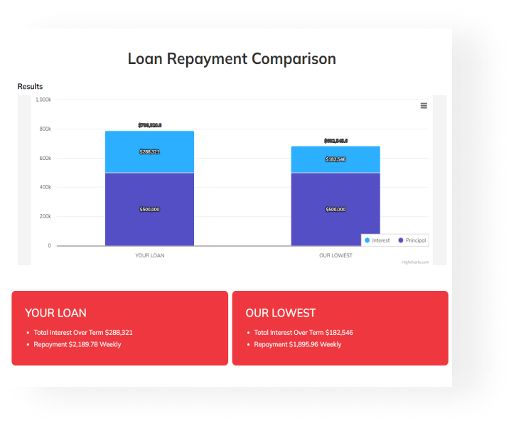
- We revolutionized the borrowing landscape by designing an interface that empowers borrowers to effortlessly evaluate intricate loan terms and essential factors.
- Collaborating seamlessly with WiseList, we expanded borrowers’ horizons by integrating an advanced Home Loan comparison tool, granting access to a vast array of lender data.
- Our commitment to transparency was realized through a meticulously crafted platform that presents borrowers with comprehensive and transparent loan information, empowering them to make well-informed decisions with confidence.
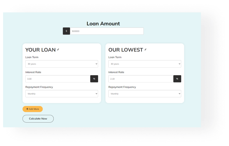
- Our experts meticulously redesigned the user interface, creating a visually captivating and user-centric experience that not only engages but also seamlessly guides borrowers.
- We enhanced the website’s speed, ensuring that borrowers experience uninterrupted and seamless browsing, optimizing the overall borrower journey.
Business Module (Tech Stack)
Our tech arsenal encompassed a suite of cutting-edge tools and technologies tailored to website redesign and loan comparison integration. This included UI/UX design tools, backend development frameworks, and API integration solutions.
Our advanced website solutions that increased their business efficiency are built with:

Impact
The client was very impressed with our input and efforts in this entire project and this testimonial is a testament to our efficiency and professionalism:
“Working with Technocrats was amazing. They seamlessly revamped our website and added loan comparison tool, making it so much better for our borrowers. Their tech skills and dedication pushed our UI/UX to another level.”
Jay Jones
Founder









 Request a


