Abstract
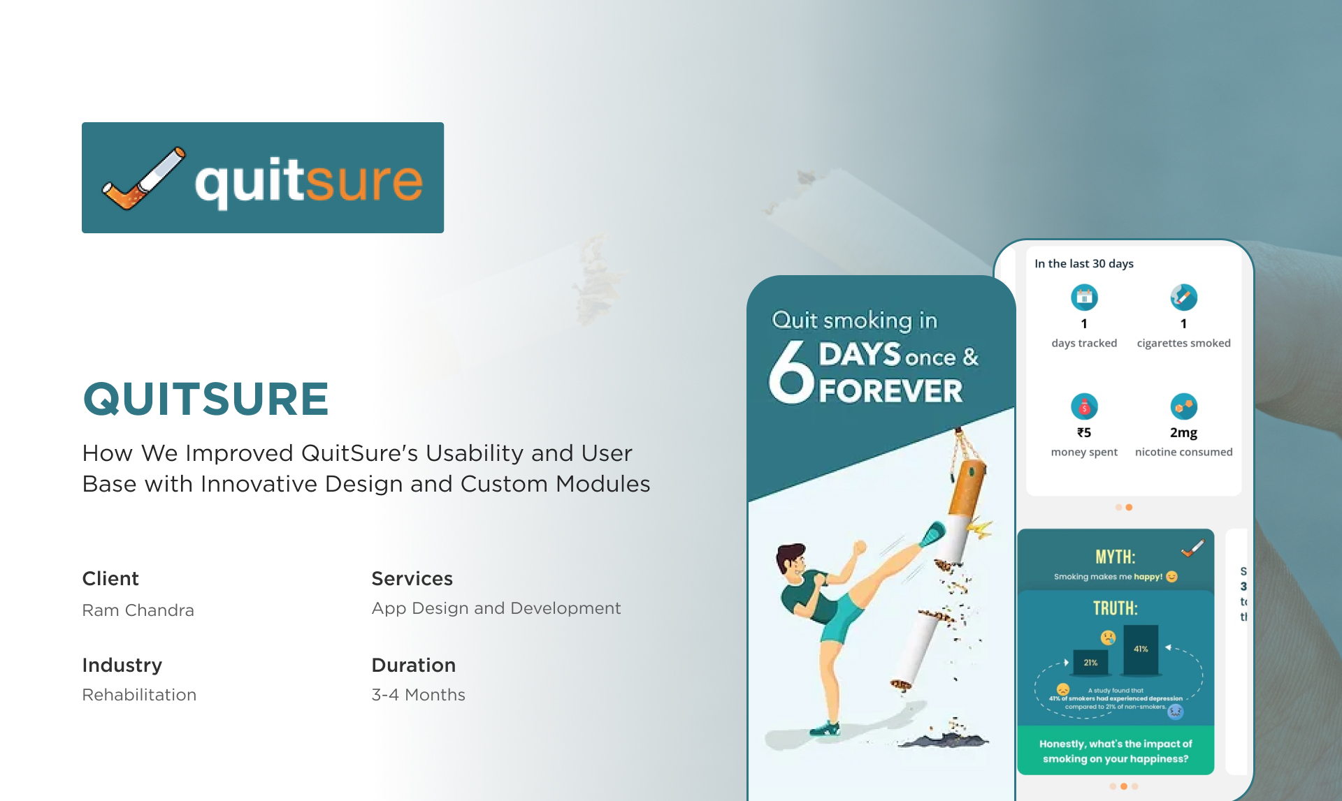
QuitSure is a mobile app that aims to help its users quit smoking based on a structured program. Having fought a battle with quitting smoking himself, the client had a great idea and built an app to help others. However, the app faced significant challenges in providing a user-friendly experience and struggled with multiple functionality issues.
They approached Technocrats to resolve this issue so it could help a higher number of users quit smoking effectively. We addressed these challenges by redesigning the app and building custom modules to enhance navigation, content management, and the overall user journey.
QuitSure: An Introduction
The founder of QuitSure himself struggled with a smoking habit for 17 years and it took him 15 years to overcome those issues. Motivated by his personal struggle and eventual success, he developed the QuitSure app to help others quit smoking more efficiently and effectively than he did.
QuitSure works on a subscription-based model and delivers daily support modules that users need to complete to reduce their nicotine dependency gradually. This app takes a supportive rather than assertive take on quitting smoking sustainably. What encourages users to stick with QuitSure is its understanding and empathetic method. This makes users feel supported and motivated to continue their journey to stop smoking.

Ram Chandra
Founder
Major Obstacles We Overcame
The client faced multiple challenges with the app which led to poor user experience and engagement. We used our technical acumen and problem-solving approach to address these issues. Let’s discover the specific problems the client experienced and the steps we took to resolve them effectively.
Problem:
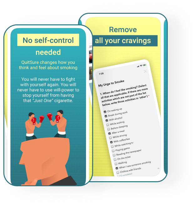
The app’s design was not user-friendly which made it difficult for users to navigate effectively.
Solution:
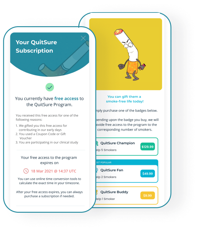
To address this issue, our team performed comprehensive usability testing to identify users’ navigation difficulties. This testing process enabled us to create new wireframes to deliver a more intuitive and user-friendly app interface. We leveraged vibrant colors to make the app’s interface visually appealing, added interactive elements to engage users, and restructured the layout to simplify the app’s navigation.
Problem:
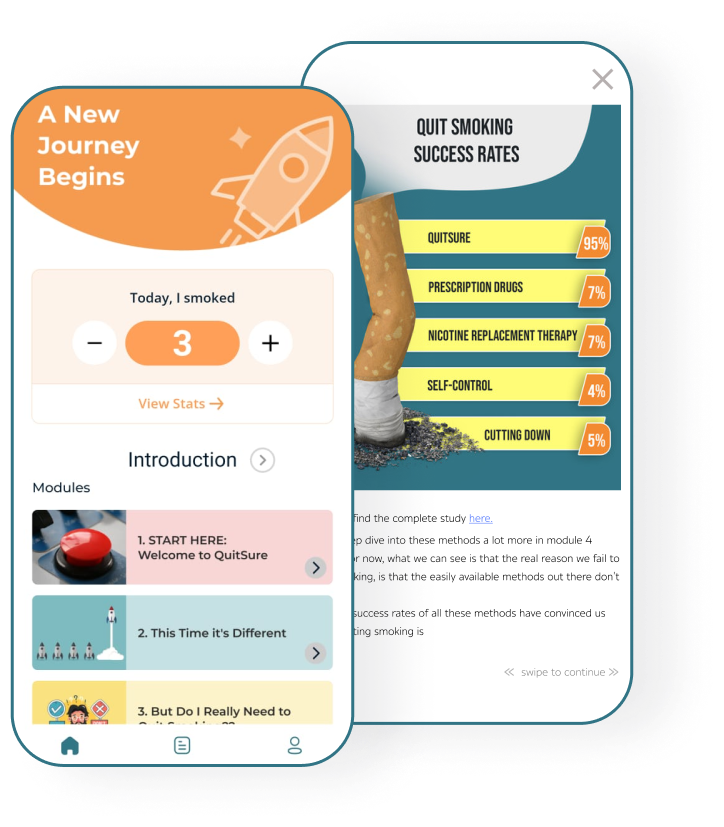
The client was struggling to develop a robust method to deliver educational content effectively to help users quit smoking in the most optimum way.
Solution:
We designed and implemented a custom app module to deliver ‘daily packages’. Here’s what these daily packages include:
- Each package contains 5-7 modules that users need to complete per day.
- We incorporated multimedia elements such as PDFs, videos, and interactive reading sections to keep the users engaged.
- To help users apply the learning, we added daily mental exercises.
- Each package came with step-by-step guidance for easy understanding and guidance.
Problem:
Managing an extensive amount of daily content was overwhelming for the client.
Solution:
We developed a sophisticated content management strategy to help the client overcome this trouble. Here’s the strategy that we followed-
- We created, bundles and uploaded daily packages
- We divided the modules into free and subscription-based packages
- We set up timely reminders to encourage users to complete their packages on time
- We scheduled the courses in a way that users would not feel overburdened. The users receive the next package after 12 hours of completing their daily package.
Problem:
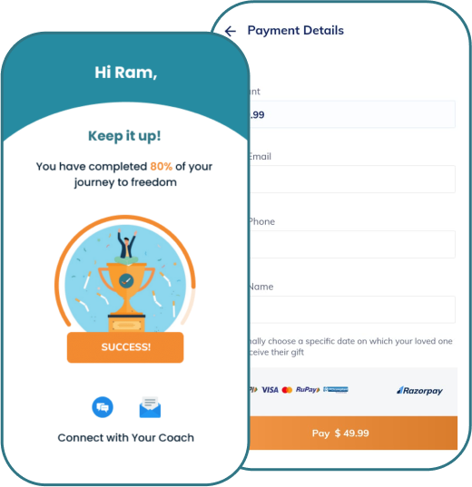
When the client came to us only 80% of payments were successful and as a subscription-based app, it was causing users frustration and making them leave the app.
Solution:
Our team performed a thorough analysis to figure out what was causing this issue. We utilized Google Firebase to track and understand the payment journey to pinpoint exactly where it was going wrong. We then integrated Razorpay to enhance the payment process, which offered a smoother and more reliable transaction experience.

Our Approach to Redesigning QuitSure for Enhanced User Experience
We identified the core issues hindering the app’s performance and then implemented strategic solutions to enhance functionality, user engagement, and overall operational efficiency.
01. Initial Consultation
02. Usability Testing
03. Wireframe
04. Redesigning
05. Custom Module Development
06. Payment Gateway Integration
07. Content Management
08. Deployment and Support
Want To Develop Your Own Solution?
We make full fledged customized strategies for the businesses planning to get started with the solutions and provide an excellent user experience to all your customers.
Outcomes We Delivered
We brought significant improvements to QuitSure redesign and technical enhancements. Overall, these changes transformed the app into a more effective tool for quitting smoking, as evidenced by user feedback and increased subscription rates.
- QuitSure had very few users when they came to us. Now they have over 1 million users.
- The app’s UI/UX redesign made it easier for users to navigate, leading to a more satisfying user experience.
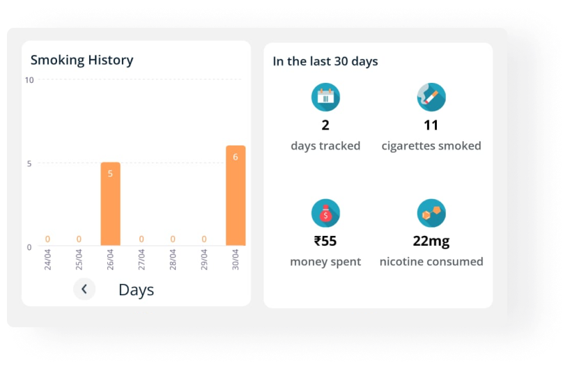
- The overall user engagement increased drastically and our daily packages are helping users to stick to their quitting goals.
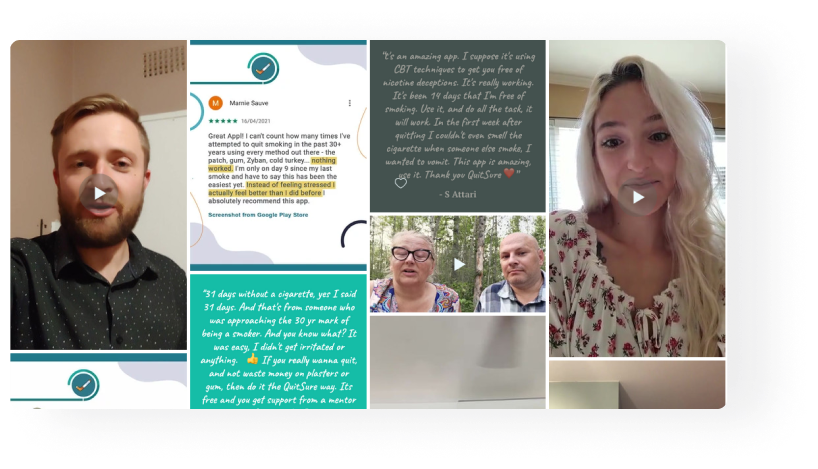
- Our app content management solutions boosted user retention and fostered consistent daily interactions.
- With Firebase tracking and Razorpay integration, we raised the payment success rate to 99% which led to a rise in revenue and client retention.
Business Module
We utilized front-end and back-end app development tools, content management systems, and payment gateway solutions, alongside analytics and user engagement platforms to help the client improve the app’s experience and scale it to a larger audience.
Our advanced website solutions that increased their business efficiency are built with:

Impact
Our client was incredibly satisfied with QuitSure’s transformation. The feedback highlights the positive impact of our work on both the app’s performance and the client’s business objectives.
“Technocrats team completely impressed me with their work on our Training Management System. They knew exactly what we needed, came up with great inputs and delivered beyond expectations. I’m thrilled with the outcome and can’t wait to work with them again.”
Ram Chandra
Founder











 Request a


